

A good use for the world's ugliest colour!
- Publish Date
- Friday, 10 June 2016, 3:32PM
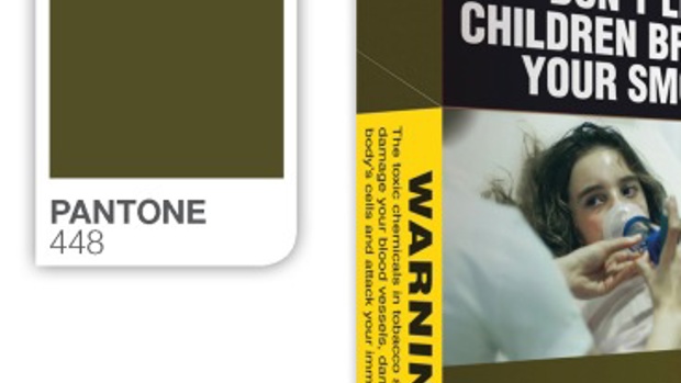
It's official: Pantone 448C is the world’s ugliest colour. In fact, a team of experts spent 3 months trying to identify it - but why? Well, it could be the key to cutting cigarette sales.
The Australian Government has commissioned a team of researchers to design new cigarette packaging aimed at discouraging people from buying them. So they set out to find the most offensive and unappealing shade to put on packets.
After examining hundreds of hues, a panel of 1,000 smokers has settled on 448C, known as ‘opaque couché’.
It’s a sludgy brown that’s been described as the color of ‘tar’, ‘dirt’, and even ‘death’. (Well that seems just about right then.)
Take your Radio, Podcasts and Music with you
